Back to News
Holmes Mann give Dulay Seymour's rebrand the seal of approval
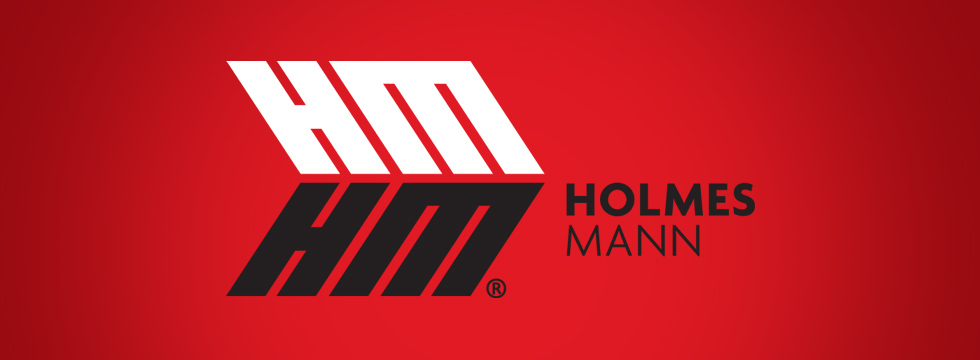
Recently we announced a contract with Bradford's packaging wizards, Holmes Mann. Our studio team have been grafting over the drawing board trying to craft a logo worthy of representing the packaging professionals well established brand. After a meticulous design process, producing concept after concept, we finally delivered a logo that we and Barny Holmes, the 5th MD of the company, have unanimously agreed is right for the job.
The final design shape is a representation of reliability and sturdy professionalism. The conscious colour choice compliments the recent purchase of Holmes Mann's distribution vans to ensure maximum impact when seen out on the road. The use of perfect dimensional symmetry is a direct reflection of Holmes Mann's painstaking attention to detail in their custom design service, analysing every dimension for packaging precision.
The arrow like outline of the logo was birthed from previous concept incarnations where the design more closely resembled that of a bow and arrow, and was adopted in a more symbolic light to represent Barny Holmes' drive to constantly maintain a forward looking direction for the company.
The company name at the forefront of the arrow tip plays the role of a subconscious call to action, luring the viewer from left to right, from problem to solution, ultimately ending up at Holmes Mann, the packaging professionals.
- posted 21/01/14